Default
resources/js/Components/Sections/Testimonials.vue
This component will render testimonials in columns (up to 4 per row on the biggest screens).
It can accept 4 properties:
- data: required, list of testimonials
- variant: optional, defines the testimonial card layout
- animateOnHover: optional, defines the testimonial card hover effects
- class: optional, list of classes to apply to wrapper
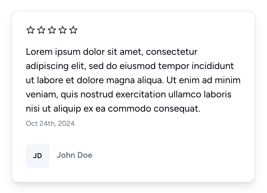
Variants
There are two predefined variants:v1 (default) and v2.
Animate on hover
WhenVITE_ANIMATIONS is set to true or 1, the default value will be set to all, otherwise it will be set to none.
You can override this behavior by passing the animate-on-hover prop.
Auto-scroll
resources/js/Components/Sections/TestimonialsAutoScroll.vue
This component will render testimonials in 2 rows, scrolling in opposite directions.
Scrolling effect is provided by Embla Carousel
It can accept 8 properties:
- data: required, list of testimonials
- variant: optional, defines the testimonial card layout
- speed: optional, defines the scrolling speed, defaults to 0.75
- draggable: optional, make cards draggable, defaults to false
- stopOnInteraction: optional, stops scrolling on interaction, defaults to false
- stopOnMouseEnter: optional, stops scrolling on mouse enter, defaults to false
- startDelay: optional, defines the delay in milliseconds before scrolling starts, defaults to 0
- class: optional, list of classes to apply to wrapper
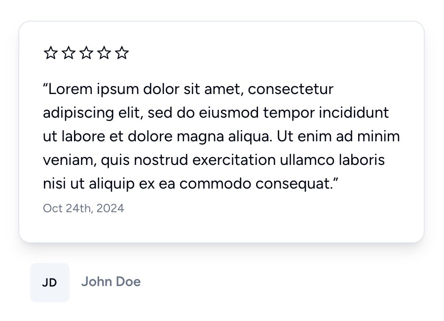
Variants
There are two predefined variants:v1 (default) and v2.